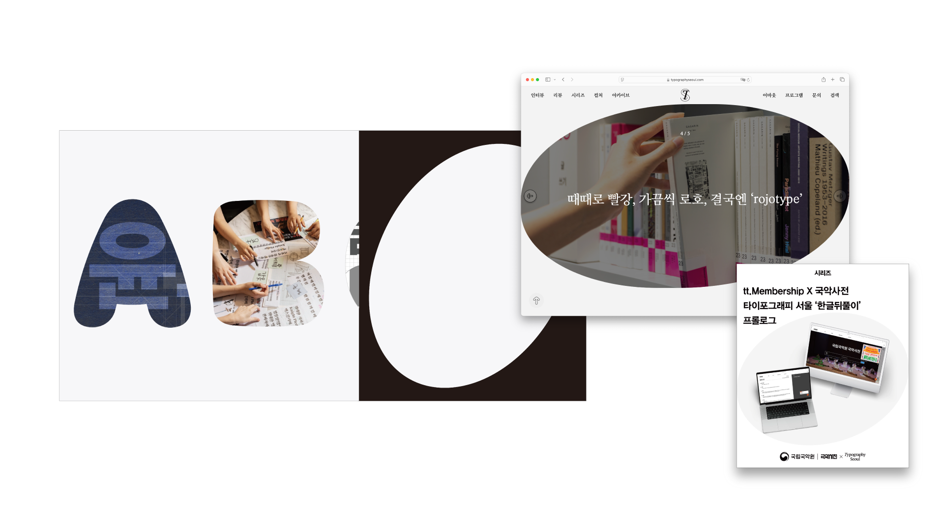
타이포그래피 서울 부분 리브랜딩
Typography Seoul Partial Renewal & Guidelines
Graphic Motifs: A Printed Magazine
This partial renewal was approached from the mindset of a writer who hopes their words will leave a lasting impression—an attempt to overcome the inherent ephemerality of digital media.
The keywords driving the direction were:
A Fast Magazine that tracks swift movements in design and typography,
Heritage that honors what endures.
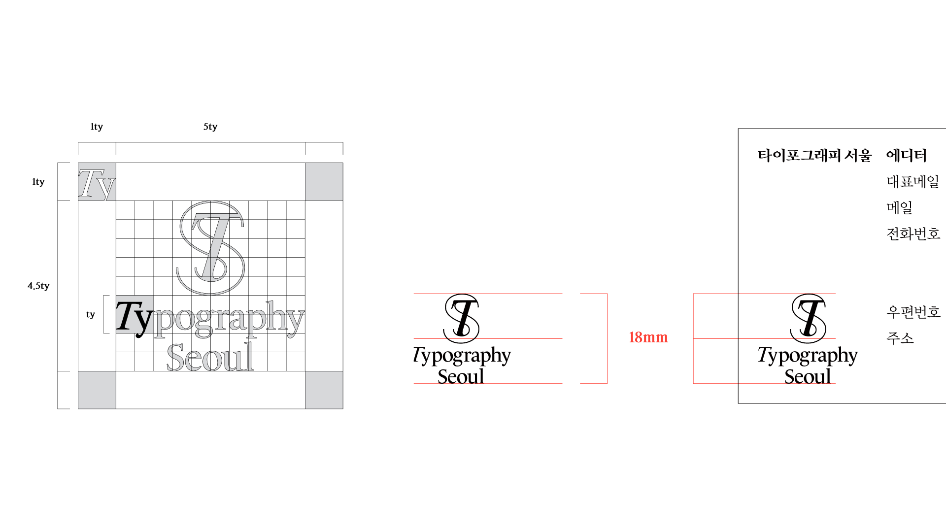
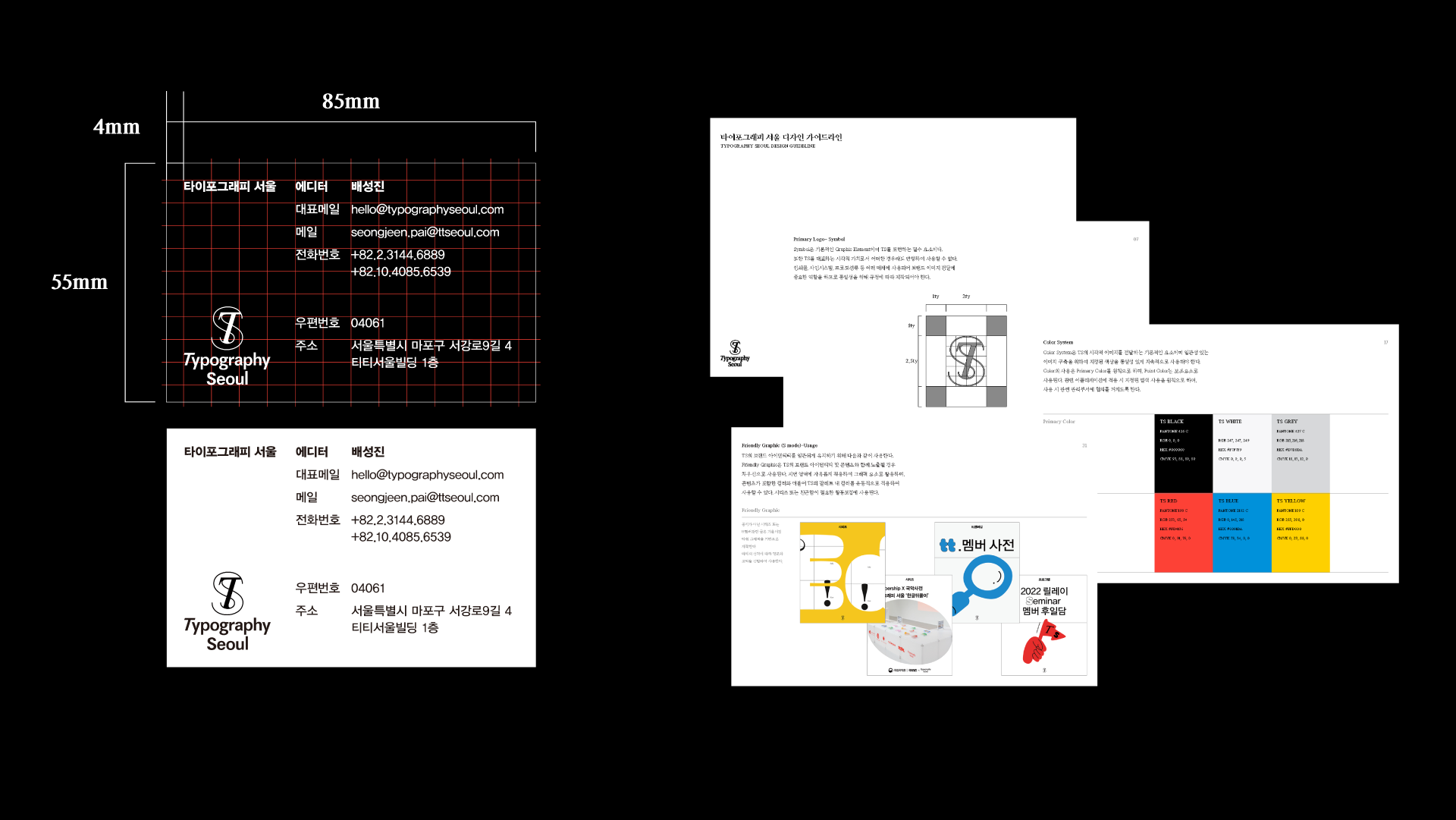
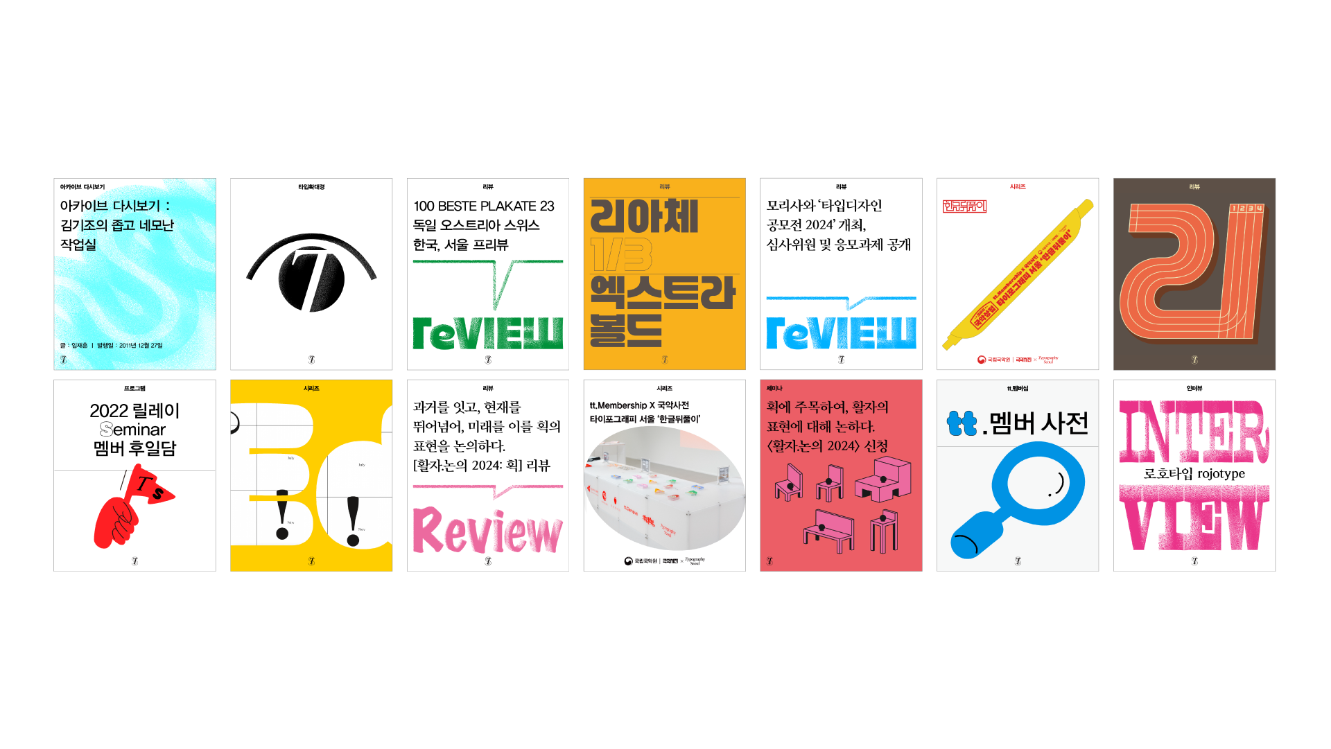
The type system is divided into Primary and Secondary,
using both gothic and serif typefaces (sans/serif, with and without strokes) in contrast and harmony.
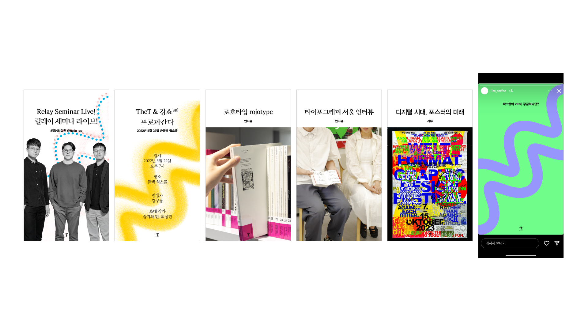
We addressed issues with the digital rendering of the original symbol, where thin lines were disappearing, and improved the typography system for Instagram articles.
디지털 매체의 휘발성을 극복하고 오래 남는 인상을 지향하는 필자의 태도에서 출발한 타이포그래피 서울 부분 리뉴얼 및 가이드라인 작업은 디자인·타이포그래피의 빠른 흐름을 담는 ‘패스트 매거진’과 지속되는 가치를 계승하는 ‘헤리티지’를 키워드로 삼아 고딕과 명조를 결합한 Primary·Secondary 타입 시스템을 구축하고 디지털 환경에서 소실되던 기존 심볼의 문제를 개선하며 인스타그램 아티클용 타이포그래피 시스템을 정비했다.
Copyright 2025. TT SEOUL. All rights reserved.